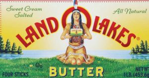
Land O’Lakes butter began in 1928 as a coop of Minnesota dairy farmers. They left their package and image alone for almost one-hundred years including the use of an Indian woman at the core of brand essence.
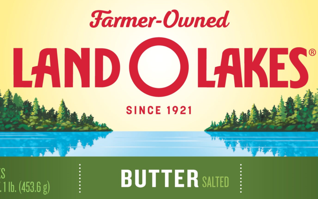
This month, they started to remove her from all packaging.

Land O’Lakes eliminated (downsized) the iconic native American woman in part due to intense responses from the community who felt it was stereotyping Indians and was a racist image. The original kneeling Indian woman was seen as offensive by Native Americans and others.
The CEO and President of Land O Lakes, Beth Ford, said that they would be using images of the farmers on their package moving forward.
Brands Live in the Present
I sympathize with the challenge for the leadership team at Land O’Lakes and the marketing team to find a way forward.
However, changes in the marketplace caused them to have to respond and modernize their image. They experienced too many negative complaints, not to respond. Moreover, they have left most of the packaging signals and imagery the same as they can transition forward. These can be difficult branding challenges and require a strong stomach.
Lessons in Package Design
- Where and when does a brand live? A brand must live in the minds of the consumers who are here today – not from the past. Often, brands stumble on imagery or messaging that is no longer contemporary or relevant. New consumers who buy butter, will only know Land O’Lakes without the Native American woman. Market your brand for the year you live in. Sometimes you have to let go of the past.
- What do you stand for? Many Americans are offended and vocal about racial stereotypes, and rightly so. In the past, they may have stayed silent. The brand owner must take a position on one side of the fence. Thus, they can’t endorse a racial stereotype and proclaim their celebration of an image that is hurtful to part of their community. The Washington Redskins football team has taken a stand to stay with the stereotype. And butter isn’t football. Know your customers.
- Brands must evolve their why. A brand can’t live in the 1940s and be relevant. Today is 2020 – and the people you serve have feelings and emotions you must respect and honor. Or, your indifference can hurt you. As Gary V likes to say, market your brand for the year you live.

365 Changes
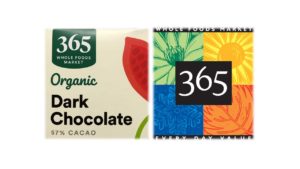
Recent changes to the 365 brand by Whole Foods disappointed me. Amazon/Whole Foods removed the colorful seasons and imagery reducing the brand logo to the number 365. This change feels corporate and disconnected from the Whole Foods Markets essence.
The original design came from my friend Nancy Frame Designs. It was vibrant and alive. Amazon/Whole Foods sucked the life out of it.
What year is your brand living in these days?
Need help spreading the love with your brand? Is your brand living in the past and need a refreshment of your brand?
I can help. You can set up a time to chat with me about your marketing challenges using my calendar. Our initial conversation is free. You talk, I listen. Email me jeffslater@themarketingsage.com or call me. 919 720 0995. Visit my website at www.themarketingsage.com Let’s explore working together today.

Photos courtesy of Land O’Lakes and Whole Foods/365 brand


Completely agree with you Jeff. Brands need to evolve to stay relevant but must be carefully thought out and executed to insure you’re not going to confuse or alienate current customers. That’s a big design challenge. For most food brands, their packaging is the most valuable touch point for customer interaction and engagement.
We appreciate the shout-out for our 365 logo design. No comment on the new 365 version other than to say we would have taken a different direction.
Brands can only stay relevant to today’s consumers – not the consumers from before. Updating packaging needs to be strategic and intentional. And few companies do it better than Nancy Frame Designs. I’m sorry to see the 365 logo I loved dissolve away. Jeff
We are too, Jeff. We understand the need to update but miss the brand’s vibrant personality and spirit as personified in the older logo.