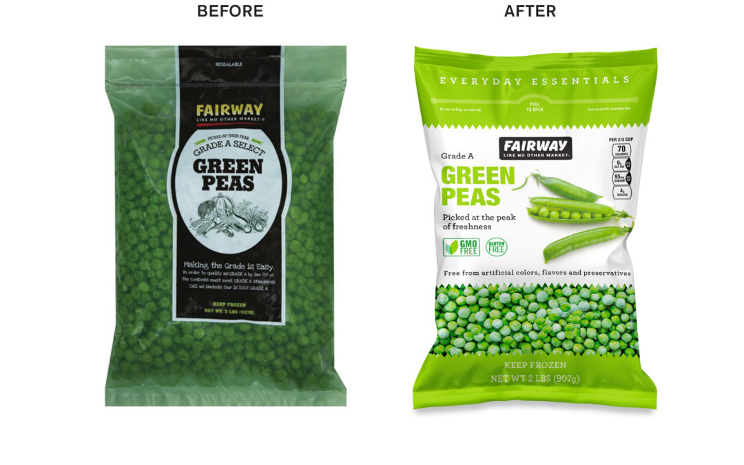
Updating your packaging can attract new customers, improve the visibility on the shelf or web page, and increase sales. Redesign can add to the bottom line for your company.
Even if your product has a robust design, a refreshed design can attract new customers while showing your current customers that you are actively involved in meeting their needs.
But how do you know when is the time is right for a redesign?
Here are a few thoughts to consider:
- Competitors have gained shelf space and reflecting new trends in the marketplace
- Your packaging doesn’t sell well on the web
- New formulas, better ingredients, more sustainable packaging materials are all excellent reasons to take a fresh look at your packaging to communicate new benefits
- You’ve had success at the regional level, now you need more substantial packaging to compete with established brands
- The new FDA requirement for updating your nutritional facts panel presents an excellent opportunity to update your principal display panel

Keeping it Fresh
There’s a certain amount of doubt around the process of redesigning. Even companies with deep pockets can struggle to keep their brands fresh and enticing new consumers without confusing current customers.
When a package design changes, the obvious question in consumers’ minds is, did the product change as well? And if so for better or worse?
It’s a supremely important consideration that requires experience and skill to visualized packaging that inspires current customers by convincing them you improved the product and entices new customers to try your brand.
Here are a few thoughts to guide the redesign process:
- Begin by listening deeply to your customers, retailers, and internal team. Get to know the people who are buying your product and identify the lens in which they view the world. How does your product fit your customer’s needs?
- Study the competition to determine how they communicate points of difference. Create your shelf set by stacking your product next to the competition. See how your message contrasts with the competitors.
- Don’t be afraid to do something different to stand out from the crowd. Injecting some personality into the package design can go a long way toward cultivating brand loyalty.
- Focus on a few key benefits and communicate them prominently. Too much information leads to visual clutter. One way to de-clutter is to use simple icons to represent critical benefits.
- Don’t feel that you should change everything at once. Make changes progressively to ensure the consumer can still recognize your brand. Depending on your size and marketing resources, you may have more latitude on how far to take a redesign. More established brands generally need to take a more evolutionary approach to make sure their customers can find them.
Brand Essence
The most significant opportunity in our business is that consumers’ tastes, preferences, and purchasing habits change all the time. We are always seeking new taste adventures, new experiences, enhanced nutrition, and greater convenience.
Make sure your package captures the essence of your brand, stands out on the shelf (or web page), and is working to communicate your brand benefit with style and personality.
We can help.
This guest post is written by my friend Nancy Frame who created beautiful and effective packaging for me when I managed brand portfolios. Nancy designed the original logos for Whole Foods 365 brand. Read about it here. Nancy Frame Design is an award-winning consumer packaging and branding agency. NFD specializes in helping food and lifestyle brands discover their unique identity by creating branding and packaging that resonates with its customers.
Do you need help with managing packaging redesign projects?
I can help. You can set up a time chat with me about your marketing challenges using my calendar. Our initial conversation is free. You talk, I listen. Email me jeffslater@themarketingsage.com or call me. 919 720 0995. Visit my website at www.themarketingsage.com. Let’s explore working together today.


