When should you consider logo transformation? Are you stuck with a logo legacy that is static and can’t evolve?
A logo encapsulates the visual essence of your brand promise in an image. But what happens when that image no longer represents where your brand is going in the future? What is the best way to make a transition from logo A to Logo B? How can you gain internal support for the update and have confidence that your audience will, over time, understand your new message?
There are several types of logos that brands use.
First is the static visual logo that shows up on your product, package, website, and brand identity. I think of this as a logo legacy, so revered that it can grow and evolve with the times.
Second, there are campaign logos that are temporary or transitory, that are designed to call attention to change that is happening.
Third, there are dynamic and motion logos that animate your static ID using the strength of digital to tell a short story.
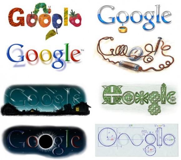
Finally, ever-changing logos, like GOOGLE, get frequently updated to represent occasions, events, or moments.
Let go of my logo
It is never easy to change a logo. You have the old guard who sees it as heresy to move away from the image that helps get you to the current place where your business exists today. They want to hold onto a vision you have invested in for years, which has built equity.
But businesses shift strategy and need sparks.
Brands need energy and a refreshed logo requires a visual rallying message that can lead the charge to the next mountain top. And in doing so, a brand needs to evolve and change again.
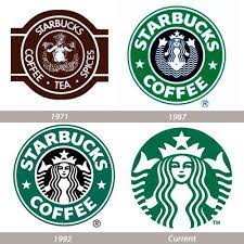
Sometimes the change is a simplification, letting go of unnecessary visual elements like Starbucks has done over the years. The latest Starbucks logo doesn’t use the words Starbucks as part of the logo. That demonstrates a visual logo’s strength. Even the evolution of the AT&T logo is another example of simplification and removing extraneous parts.
Apple’s logo has evolved into a more straightforward visual icon and, like Starbucks, doesn’t even include the brand name.
Steps for Success
If you are contemplating a logo design change, here are the steps I’d urge you to take. It isn’t easy, but I think it can be a proven path to success.
Establish criteria before anyone puts pen to paper (or finger to keyboard). Make sure that you have some way to measure if a visualization lives up to the requirements. This work starts as a strategic exercise so get alignment and clarity about the reasons you are evolving the image.

Work with an established, professional design agency that has a solid reputation for developing brand identity. Yes, there are plenty of freelancers and low-cost methods to pick a font, color, and images. But, for something as important as your brand, don’t skimp on this critical partner.
Recognize that your brand is more than your logo, but you’ll probably use this logo to help communicate, often with multiple audiences, the essence of who you are. You want a logo that can visually sum up your story that can take many words to describe. My friend Nancy Frame designed Whole Foods Markets 365 brand logo. See the background story here. 365 represents Whole Foods Markets every day value-line – many billions of dollars.

Don’t fear to be bold if your strategy is aggressive and shifting you in a new direction. Breaking through the everyday noise and clutter isn’t easy. Sometimes you need to be as visually disruptive if your brand is moving in that same direction.
Build up a tough skin since you’ll have many shooting arrows at your ideas.
In the end, if you are clear on who makes the decision and what the criteria are for evaluation, don’t be afraid of following your gut. Since you are responsible for selling the idea internally and externally, you better believe in it with full-throated confidence. Everyone loves to have an opinion about logos.
Listen respectfully, but don’t overreact to sharp criticism.
Is it time for you to recreate a refreshed logo that signals where you are heading?
I have a lot of experience in this space so please reach out if a logo redesign is in your future.
Maybe, I can be of help?
Photo: Starbucks, Google, and Apple. All rights reserved.
Photo by lalo Hernandez on Unsplash


