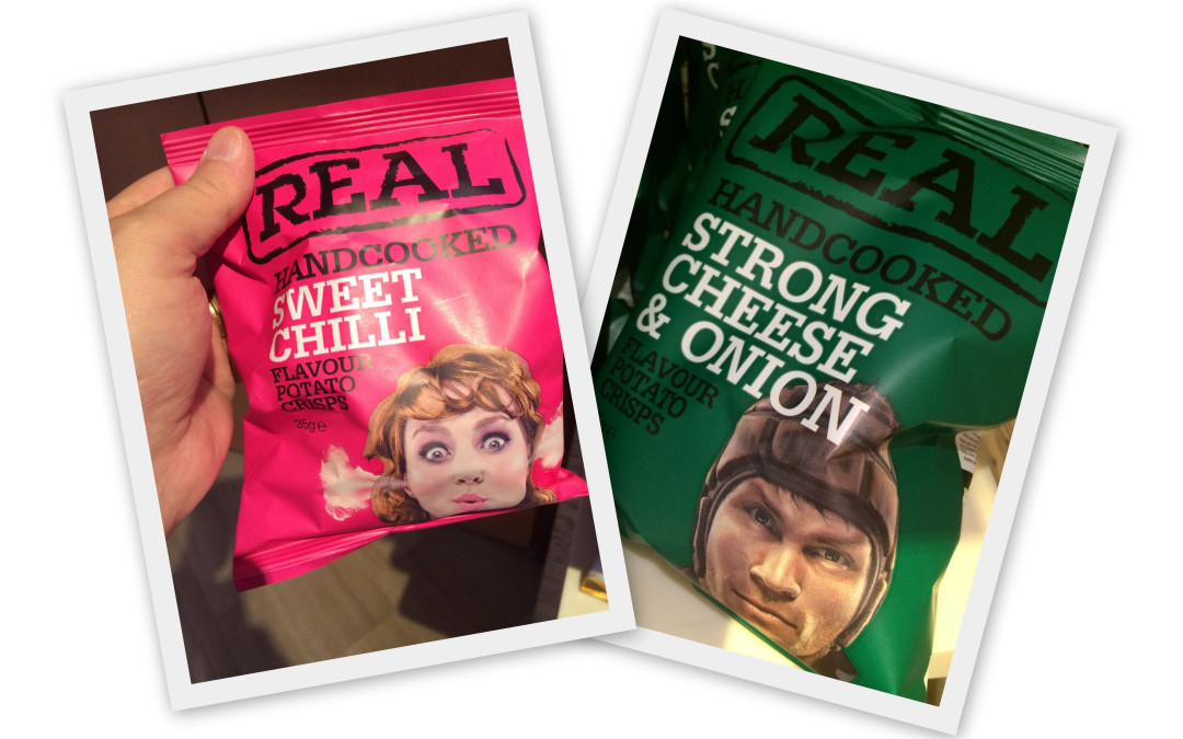
Packaging is a real art form and vital for getting your product to be noticed. From marketing brownies, fresh squeezed juices, Cheerwine, Slim Jim and dozens of other products, I have learned a few tricks of the trade.
Here are nine ideas to prevent the most common packaging mistakes.
- CONTEXT COUNTS: The most common packaging mistake I see, over and over, is when product or brand managers create a design they love out of context. They view the graphics in a conference but make the mistake of not putting the product on a shelf, in a real store to see how it looks in situ. Take a mock up and put it on a shelf. Does it pop? Can you easily see it or does it get lost on the shelf?
- DON’T BE LIKE EVERYONE ELSE: If you are the tenth brand on the shelf in gold, you will blend into the category. Stand out. Be different and do it for a purpose. Either through package shape or color or design, own something that makes it easy for anyone to go into the store and find you on the shelf.
- KNOW YOUR TARGET: If you are marketing to an older audience, how good is their eyesight? Help them out with bigger font. You want people to be able to read your sell copy.
- LIMIT YOUR SKUS: One of the most common pieces of advice I give, is don’t overextend your product line. Typically, three is plenty. One SKU will do 60% of your volume with the other two doing the other 40%. Keep it simple and don’t make it so complicated to choose.
- REMEMBER, I DON’T KNOW YOUR BRAND: Marketers often have to fight which is bigger the brand or the category describer. One of the brands I marketed was called Pemmican, a brand of beef jerky. Which was bigger – Pemmican or Beef Jerky. I always wanted the brand name to be larger and my sales colleagues believed the category needed to be bigger. If you are marketing a product in a new category, the category may need to be big so people know what is in the box or bag.
- WHAT IS SPECIAL? Is there one salient message you want to communicate? This product has the highest antioxidant properties of any fruit. Our beverage is filled with vitamins. No artificial flavors. No high fructose syrup. Pick one key differentiator and make sure it is clear.
- DRIVE TO THE WEB: How can you creatively get customers to a social media site to become part of a wider community? Most people don’t want to be friends with your brand. But can you drive them to a cause or something larger than the brand that may motivate you? Kind drives consumers to participate in their Kind Cause fund where you can help give $10,000 to a cause the community votes on together.
- DECLARATION OF INGREDIENTS: Most categories require specific nutritional fact declaration and ingredients descriptions. But can you find a way to highlight something important, different and meaningful? Some brands use a yellow highlight to emphasize lower salt, lower sugar, etc.
- HUMANIZE THE PRODUCT: I am surprised that brands don’t use photographs or images of people more often. They can convey emotion and energy better than most graphics. I love the example I used on this blog post that I found in London at Heathrow Airport. I could help myself but had to buy the product.
Is your packaging working hard enough for your brand?
Need some help dressing up a brand for the big show? Connect with me and let’s talk packaging and other marketing topics.


