One of my food service industry clients needed a rebrand. Their logo didn’t stand for anything. It was somewhat generic. Their logo didn’t have a tagline that helps to explain what business it was in and what they did for clients.
To rebrand, we did a few simple exercises and followed these seven simple steps to rebranding.
- PERSONALITY: We got several key people in the company to fill out a questionnaire that asks them a range of questions geared toward defining their brand (company’s) personality, attitude, and image. Are you a fun and exciting brand or one that is serious? Would you drive a sports car or something practical like a minivan? Through these questions, we started to find words that helped us filter what the brand represented. Single words a short-phrases are powerful ways to start this process.
- WHY: We discussed their why – Why are they in business? Beyond money, what is the motivation for their work? What truly drives them each day – beyond a paycheck? Apple is a brand for people who think differently. They make products for people who want to “put a dent in the universe.” In exploring this deeper element of why we could work our way through the what and the were in their golden circle. See this post about Simon Sinek for more on this topic.
- DESIGN: A design firm created both a range of taglines and graphic representations of the brand. What would this brand look like – from colors, shapes, and forms – to words that communicate purpose and value. We started with more than fifty taglines and kept eliminating ones that didn’t have some kind emotional or evocative connection. Same with the logos – we kept working our way toward simple, clear and concise.
- MARINATE: As we reviewed the top three options, we shared with the management team each image and tagline, and allowed each one to marinate with them over time. They had them hanging on their walls and mock-websites so that they could keep revisiting them at different times in the day. Slowly, we eliminated one option, and two-finalist emerged.
- CROWDSOURCE: We shared the two finalists with a select group of employees, vendors, and customers without giving them any information. What we said, here is our current logo, and here are two options we are considering. Then we gave them a blank verbatim box to say – what do you think. We learned a lot and ended up deleting one because one element wasn’t as clear. And, the other option was the clear favorite of the crowd of about 100 people. No one saw anything that troubled them.
- DECISION TIME: The leadership team decided to make a slight tweak to the leading choice, and we moved forward rebranding the website, business cards, stationery, templates, etc.
- BRAND STANDARDS: We created a set of brand standards to give guidelines to anyone who would be using the logo, so that type, color, font, positioning, etc. was clear for anyone who used our brand.
Does your logo communicate the essence of why your brand exists, who you are and what you do? Are you sure your target audience gets it?
Since I am under a non-disclosure agreement, I’m not at liberty to show the work and the iterative process. But if you are considering a brand evolution, let’s talk, and perhaps I can be of help using this process with you and your team. Text me at 919 720 0995 or email me at jeffslater@themarketingsage.com
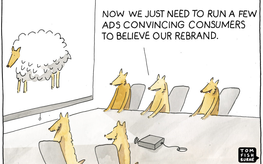
Photo credit: Tom Fishburne. Check out Tom’s great cartoons about marketing here. I’m fortunate to have worked with Tom on several projects and not only is here a brilliant illustrator and marketing thought-leaders, he is a great guy. Please check out his work and sign up for his weekly marketing cartoons and posts


