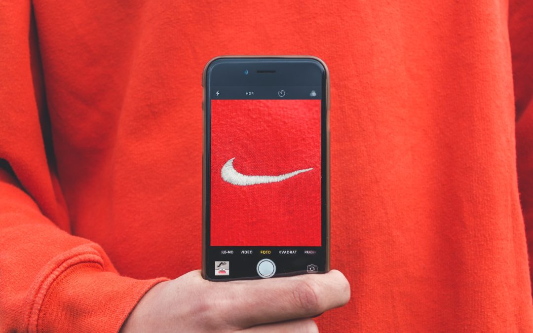
The Evolution of Logos: Adapting to the Mobile Era
Adaptation is critical to staying relevant in the fast-paced branding and design world.
With the increasing prevalence of smartphones and mobile screens in our daily lives, brands are recognizing the need to simplify their logos to ensure they make a lasting impression in the palm of your hand.
A great example is Johnson & Johnson changing their 135-year-old logo to meet the mobile moment.

Ben Schott is Bloomberg Opinion’s advertising and brands columnist who created this helpful video explaining this logo trend. If you can’t see the video below, click HERE.
As a branding expert in design, I’m here to delve into this fascinating trend and showcase examples of how logos are evolving to meet the demands of the mobile era.
Starbucks: Sipping Simplicity
Starbucks, a global coffeehouse chain, has continuously evolved its logo to stay relevant in the digital age. Their recent logo simplification is a testament to this trend.
While retaining the iconic mermaid or siren, Starbucks has gradually removed the text and simplified the design. This minimalist approach ensures that their logo looks great on mobile screens, whether you’re ordering through the Starbucks app or scrolling through social media.
Pringles: Pruned Perfection
Pringles, known for its stackable potato chips, has embraced logo simplification to maintain brand recognition across various digital platforms.
The recent redesign features a more streamlined Mr. Pringle character and simplified lettering. This modernization allows for better scalability and clarity on mobile screens, making it easier for snack enthusiasts to identify their favorite crisps while shopping online or using mobile apps.
Dunkin’ (formerly Dunkin’ Donuts): Dunkin’ into the Digital Era
Dunkin’, a well-loved coffee and donut chain, made a significant branding change by dropping “Donuts” from its name and simplifying its logo to meet the demands of the mobile era.
The new logo features a bold and straightforward font with a bright orange and pink color scheme. This minimalist design is visually appealing and optimized for mobile screens, allowing Dunkin’ to maintain a solid online presence and mobile app usability.
These examples highlight how even established food companies recognize the importance of adapting their logos to the mobile era. By embracing Simplicity, versatility, and mobile-friendliness, these brands ensure that their logos continue to leave a lasting impression in the palm of your hand, whether you’re ordering coffee chips or planning your next snack run.
Apple: The Epitome of Minimalism
Let’s start with a classic example of logo simplification: Apple. Over the years, Apple has mastered the art of minimalism in design, and its logo is a testament to this approach. From the intricate rainbow apple of the 1970s to the sleek, monochromatic apple of today, Apple’s logo has undergone a significant transformation.
The simplified logo looks excellent on the back of an iPhone and scales down beautifully on smaller screens, making it instantly recognizable and memorable.
Google: From Cluttered to Clean
The search engine giant Google has also hopped on the mobile-friendly logo redesign bandwagon. Their initial logo was colorful, playful, and cluttered with beveled letters, but as the mobile era dawned, they recognized the need for change.
The result? A clean, sans-serif font with bright primary colors. This new logo is optimized for mobile screens, ensuring readability even on the smallest devices. It’s a prime example of how Simplicity can enhance brand recognition in the digital age.
Mastercard: A Masterful Simplification
Mastercard is a brand that operates in a world of financial transactions, which have increasingly shifted to mobile platforms. To keep up with the times, they streamlined their iconic logo.
The new design retains the distinctive red and yellow interlocking circles while removing the text, allowing for more versatility across digital platforms. This redesign simplifies their logo’s appearance and ensures it remains memorable in the mobile era.
Airbnb: A Breath of Fresh Air
Airbnb’s logo evolution is an inspiring example of adapting to the mobile era while embracing the principles of Simplicity and inclusivity. Their initial logo was a complex, ornate design, but they recognized the need for a change aligned with their brand’s values and the mobile user experience.
The result is a symbol representing a heart and a location pin, conveying a love for travel and adventure. The simplified design adapts effortlessly to mobile screens and complements Airbnb’s user-friendly mobile app.
Instagram: Instant Recognition
Instagram, a platform built primarily for mobile use, understands the importance of mobile-friendly logos. While their original logo was a detailed and realistic camera, they transitioned to a simplified, flat design that resonated better with their mobile-first audience.
The new logo features a simple, stylized camera icon with a vibrant gradient background. This design choice looks stunning on mobile screens and maintains brand recognition, even when reduced to a tiny app icon.
The Logo Evolution
The evolution of logos to adapt to the mobile era is a fascinating journey that showcases the power of Simplicity in design. Brands like Apple, Google, Mastercard, Airbnb, and Instagram have all recognized the importance of creating logos that are not only visually appealing but also optimized for the digital age.
As a branding expert in design, I encourage businesses to consider the implications of their logo design in the mobile era. A well-executed, mobile-friendly logo can significantly impact brand recognition, user engagement, and success in today’s digital landscape.
If you’re looking to rebrand or update your logo, remember the mantra of simplicity, versatility, and mobile friendliness.
Your logo is often the first impression your audience gets of your brand, and in the mobile era, making that impression count is more important than ever.
You can set up a time to chat with me about your marketing challenges using my calendar. Email me jeffslater@themarketingsage.com Call me. 919 720 0995. The conversation is free, and we can explore if working together makes sense. Watch a short video about working with me.
Photo by Kristian Egelund on Unsplash


