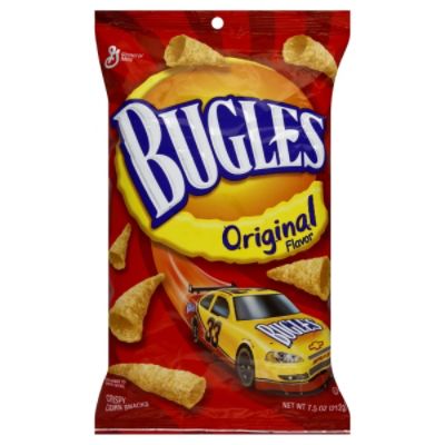
I have always been amused by the notion that snack food companies confuse consumers with the word original as if it were a flavor. From General Mills, Frito Lays and ConAgra Foods to almost every other brand, the word original shows up as if it is a flavor when of course it refers to the original product.
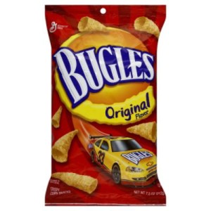 |
| Original Bugles |
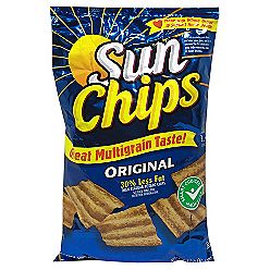 |
| Original Sun Chips |
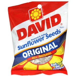 |
| Original David Sunflower Seeds |
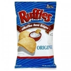 |
| Original Ruffles (with ridges) |
Does this confuse the consumer? What does the original flavor of Lays potato chips taste like? It isn’t barbecue or salt and pepper or spicy chili cheese. Original isn’t a flavor and until recently, most brands made this confusing packaging error. Recently, some perceptive marketing brand managers figured this out and have changed the designation to Original Recipe, Original Mix or dropped original and instead used the word Classic. Bravo.
Package design is an art and great package design is a joy to behold. How can you be truly original in creating a package? I have been involved in dozens of packaging projects in my consumer packaged goods career. Working with a great firm is important like the folks at Cornerstone Strategic Branding in NYC. Smart guys like Chris Nunes, their CEO, can be enormously helpful at providing strategic structure and discipline in the design process. Check out their portfolio to see how to do it right.
From my work with Chris and others, I have created eight rules to serve as a guide for this type of work. Some are quite obvious and others more subtle. I’d love your comments on these thoughts.
Always design the package with your target in mind. If you are selling fifty some, remember that you want them to be able to read the font so keep in mind who your audience will be.
 |
| Can your target read your copy? |
Mock it up and put it in context. It is so critical that you see how your beautiful design looks in the store. The idea of doing design work in an office without seeing it on the shelf is just stupid. If you have three competitors use black, why would you want to blur into the same void? In the picture below, if I told you to get me the shampoo in the red package, you are at least at the brand family.
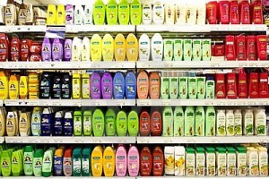 |
| How does your product look in context? |
Is it clear that you have your message priorities straight? What is the primary message you want to communicate? What’s secondary, etc. Many consumers may not know what is in the bag (or box) so sometimes the product category may be more important than the brand name in size. Is this cat food or dog food? Prioritize your prime message. Some marketers refer to this as a decision tree. For example: I want cat food. I want natural cat food. I will consider 3 brands. I want tuna flavor. I want a small bag.
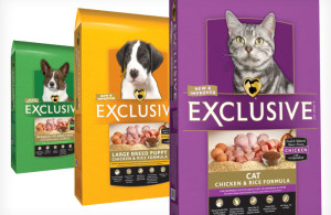 |
| What’s the first level of your product decision tree? |
How can you be different? If your package looks like everyone else, how can you grab attention? Study the competition. Do they use illustration or photography? Are they filled with text and no pictures or vice versa? Figure out how you can be distinctive. (I’m the upside down can)
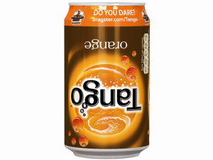 |
| We are upside down! |
Send Grandma into the store. There is an old adage in marketing about making sure your grandmother could go to the store and bring home your brand. What incredibly distinctive and idiosyncratic aspect of design can give you that hook? Grandma will bring home the right artificial sweeter if you ask for the pink one. If you ask her to get POM brand of pomegranate juice, you can describe the unique figure 8 shaped bottle. Own something.
 |
| Can Grandma find your brand? |
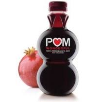 |
| Clever and distinctive figure 8 design |
Who (or what) is the hero? Is the product the hero or is there something about the brand that is a bigger part of your message? As you look at various designs, keep in mind what you are selling. Sometimes what is for sale is more important than the product. Think benefits to the target not features. Are you selling ingredients mixed together or are you selling the convenience of an easy meal? Conveying convenience is a different message than describing what is in the box.
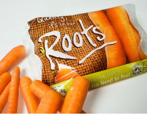 |
| What is the root of your brand ethos? |
What does the package structure communicate about your brand? There are PET (plastic) wine bottles that hold 750 ml of wine like a standard bottle but they look about 30% smaller since they use less material than glass. Does this work with your brand image or against it? For an eco-wine it might be an asset but for a value brand, it could make you look like you are the same price but smaller. Size and the physical structure matter.
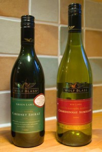 |
| Does your package structure tell reinforce your brand position? |
Is your design too professional? When my wife and I started selling our brownies in the freezer case, instead of going to a professional design firm, we did it ourselves. This is often a big mistake but we studied the section and found everything looked the same- beautifully designed. We wanted to convey homemade so we created a look and feel that felt exactly like the ethos of the brand. Sometimes in a world of great design, the amateur can stand out. I remember Ben Cohen from Ben & Jerry’s telling me once that he thought his unprofessional and amateurish packaging design was one of the reasons that consumers could easily find his product on the shelf. It didn’t look like other well-designed products.
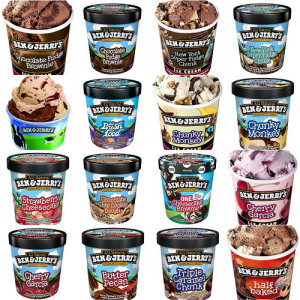 |
| Do you stand apart from your competitors? |
So how can you be an original? Don’t follow the herd. Be different but make sure your target consumer knows what you are selling.
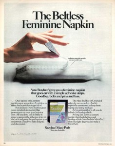
One final package design anecdote, many years ago my wife asked me to get some things for her at the drug store. It was a pretty easy trip and I found everything but got hung up one item. She wanted me to find feminine napkin product under the well-known brand Stayfree. There were about 32 choices. Her shopping list said that on the package it will be described as NOT-BELTLESS. To this day, I am still confused. Does that mean with a belt or without?
Tighten up your communication through clear package design.
A favor?
If you enjoy my blog posts on marketing or other topics, how about sharing them with your friends on Facebook, Twitter, LinkedIn, Stumbleupon or other social media? You can also sign up to receive these posts in your in box for free. I won’t spam you with offers for toasters. Thanks for reading.




Great post:
As you described above, the right packaging will make a product both appealing and easier to find, which will help a company to lower its average cost per sale. (or cost per acquisition)
Peter, You make a great point. Clear communication in packaging is a good investment to helping you effectively lower your cost/sale. Thanks for the comment.
Jeff