How can an iconic image of rabbits, bears, or farmers help you tell a friend about a new brand?
Sometimes I’ll taste a new product or beverage and can’t remember its brand name. Sometimes I remember the package with the Kodiak bear, farmer, or rabbit on the box.
In branding and packaging design, one of the most effective ways to create a unique and recognizable product is by incorporating an iconic image or character. A character on a package can help consumers instantly identify and remember a brand, making spreading word of mouth and generating brand loyalty easier.
Mr. Peanut, Mr. Quaker Oats, and Tony the Tiger
Think of some of the most recognizable characters in the food industry: Mr. Peanut, the Quaker Oats Man, the Pillsbury Doughboy, and Tony the Tiger. These characters have become iconic not just because of their longevity but because they’ve become synonymous with the brands they represent.
For example, Mr. Peanut has been the face of Planters’ peanuts and snacks for over a century. His monocle, top hat, and cane have become instantly recognizable, making it easy for consumers to spot a package of Planters on the shelf.
Similarly, the Quaker Oats Man has been the face of Quaker Oats since the late 1800s, and his presence on the package has helped to establish the brand as a trusted and reliable source of breakfast food.
But it’s not just big brands that can benefit from using an iconic image or character on their packaging. Smaller brands can also use this strategy to make their products stand out on the shelf and create a memorable brand identity.
Take, for example, Pirate’s Booty. The brand uses a cartoon pirate on its packaging to represent its “treasure” of healthy snacks. The pirate character is fun and whimsical, making it a hit for kids and adults.
Another example is Annie’s Homegrown, which uses a cartoon rabbit on its packaging to represent its commitment to using organic and natural ingredients.
Three Farmers
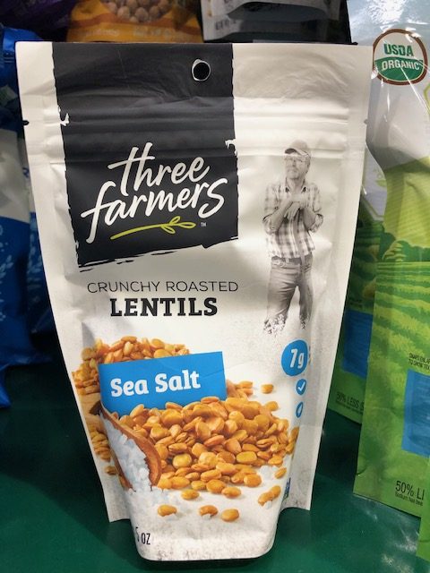
While browsing my local Harris Teeter grocery store, I stumbled upon a new brand called Three Farmers. They sell crunchy, toasted lentils. I bought the product and loved the unusual combination of sea salt flavor on these crunchy lentils. Sometimes I want to crunch on a snack – but want something healthy.
I told a friend I had eaten an excellent new snack and couldn’t remember their name. But then it occurred to me it had a farmer on the package and was sold in the snack aisle.
She found the product and loved it too.
Using an iconic image or character on a package design can be crucial in creating a memorable and recognizable brand identity. This is true for both big and small brands.
Other Iconic Images on Brands
Other small brands that have used a character on their packaging to create a memorable brand identity include:
KIND Bars: The brand uses a logo that resembles a hand-written note, with a smiling face in the letter “i.”
Chobani: The brand’s logo includes a friendly-looking, hand-drawn cow, which has become an iconic symbol of its commitment to natural ingredients.
Tostitos: The brand’s packaging features a fun, cartoon-style image of friends gathering around a bowl of chips and dip.
Method: The eco-friendly cleaning brand uses a clean and simple design featuring a leaf graphic, which has become an iconic symbol of its commitment to sustainability.
Burt’s Bees: The brand’s packaging features a cute and whimsical illustration of a honeybee, which has become synonymous with its natural and sustainable products.
Laughing Cow: The brand’s packaging features a playful illustration of a cow with a big smile, which has become a memorable and recognizable symbol of their cheese products.
Kashi: The brand’s packaging features a simple sunrise graphic, which has become an iconic symbol of their commitment to natural and healthy ingredients.
Cheerios: The brand’s packaging features a friendly-looking cartoon bee, which has become an iconic symbol of their breakfast cereals.
Green Giant: The brand’s packaging features a memorable image of the “Jolly Green Giant,” a friendly giant synonymous with its frozen vegetable products.
Snapple: The brand’s packaging features an animated image of a cartoon apple with a smiling face, becoming an iconic symbol of their fun and flavorful drinks.
These small brands have succeeded by using a character on their packaging to create a memorable and recognizable brand identity. By doing so, they’ve made it easier for consumers to find their products on the shelf and to spread word of mouth about their brand.
How will your consumer tell their friends how to find your product?
Got any farmers on your package?
You can set up a time to chat with me about your marketing challenges using my calendar. Email me jeffslater@themarketingsage.com Call me. 919 720 0995. The conversation is free, and we can explore if working together makes sense. Watch a short video about working with me.


